1、概念

element+是一款用于制作页面样式,设计页面结构的框架。相比于其他的几个框架,这个框架设计的更为人性化,对企业级框架VUE的集成也很高。
1.1、设计原则
1.1.1、一致:
一致:
1.1.2、反馈:
1.1.3、效率:
1.1.4、可控:
1.2、页面导航栏
1.2.1、页面导航栏概念
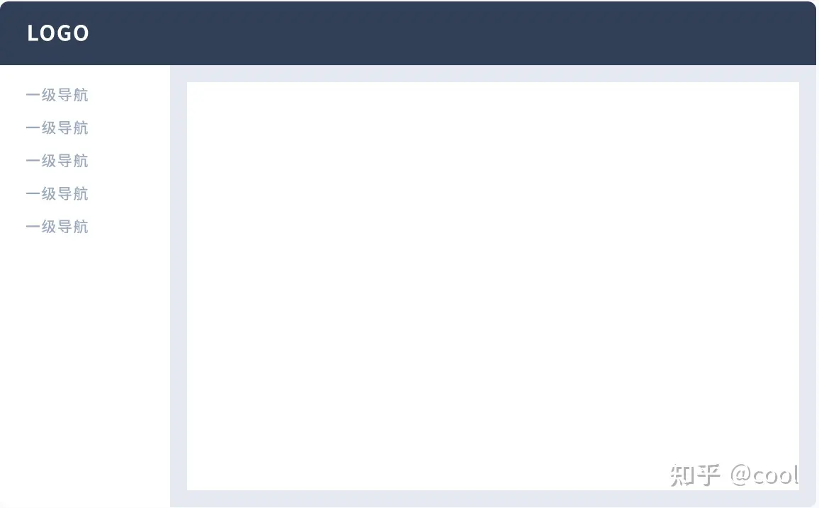
导航可以解决用户在访问页面时:在哪里,去哪里,怎样去的问题。 一般导航会有「侧栏导航」和「顶部导航」2 种类型。
类似于下图所示:
如果针对较为复杂的网页,Element+也提供了不同的类目的处理方式,如下图所示的二级类目:
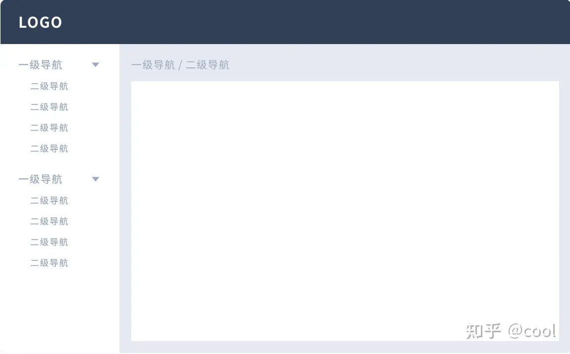
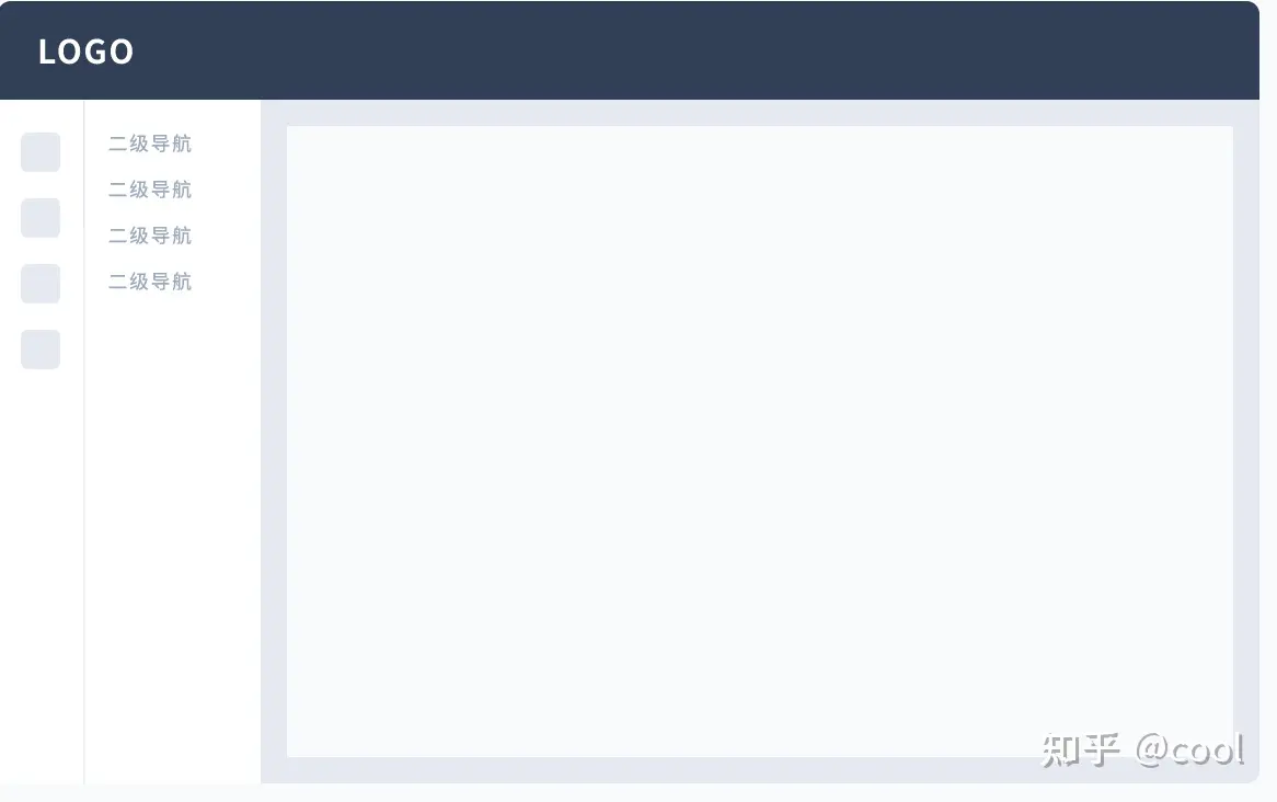
或者是更为复杂的三级类目等:
相信很多同学都见过这种类似的布局。那么这些布局在未来的前端学习中也是一个不可或缺的部分。
这些的编写方法,我们稍后会讲到。
2、安装element+
2.1、环境支持
从之前一路学过来的同学们对这个肯定不会陌生,我们在学习一个新框架的时候一定离不开对环境的配置。我也相信现在应该没有同学会用什么360、qq等浏览器去完成我们的代码编写了。
那么让我们看看支持element+的浏览器。如果没有该版本,请自行去下载最新版。这边推荐使用google的Chrome来调试。
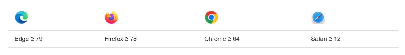
注意!!Element+不支持IE浏览器
2.2、使用vscode安装element+
# NPM $ npm install element-plus --save
2.2.1、使用网络环境引入element+(不推荐)
<head> <!-- Import style --> <link rel="stylesheet" href="//unpkg.com/element-plus/dist/index.css" /> <!-- Import Vue 3 --> <script src="//unpkg.com/vue@3"></script> <!-- Import component library --> <script src="//unpkg.com/element-plus"></script> </head>
2.3、使用网页引入的html版本的Element+案例(不推荐)
由于Element+和Vue的集成度很高,所以对于这个框架在Vue中的使用我们会在稍后的课程中讲到。这节课我们首先尝试一下最简单的引入模式。至于为什么不推荐,等会在我们使用他的在线编译的时候同学们就会明白老师为什么这么说了。
<!--使用html引入的helloworld程序--> <html> <head> <meta charset="UTF-8" /> <meta name="viewport" content="width=device-width,initial-scale=1.0" /> <script src="https://unpkg.com/vue@next"></script> <!-- import CSS --> <link rel="stylesheet" href="https://unpkg.com/element-plus/dist/index.css"> <!-- import JavaScript --> <script src="https://unpkg.com/element-plus"></script> <title>Element Plus demo</title> </head> <body> <div id="app"> <el-button>{{ message }}</el-button> </div> <script> const App = { data() { return { message: "Hello Element Plus", }; }, }; // 可以使用,但是不推荐 // 这块代码的意思在后面接触到vue的时候会有讲解 const app = Vue.createApp(App); app.use(ElementPlus); app.mount("#app"); </script> </body> </html>
3、Element+实践
3.1、Element+在vue中的引入(了解,后面vue学习中会用到)
在后期学习过vue以后,在main.ts文件中加入如下代码来引入Element+
// main.ts import { createApp } from 'vue' import ElementPlus from 'element-plus' import 'element-plus/dist/index.css' import App from './App.vue' const app = createApp(App) app.use(ElementPlus) app.mount('#app')
3.2、Element+的页面布局
Element+官网:https://element-plus.org/zh-CN/component/button.html
在官网中找到如下内容:

这个布局容器分为几种:
<el-container>:外层容器。 当子元素中包含 <el-header> 或 <el-footer> 时,全部子元素会垂直上下排列, 否则会水平左右排列。
<el-header>:顶栏容器。
<el-aside>:侧边栏容器。
<el-main>:主要区域容器。
<el-footer>:底栏容器。
如果觉得理解困难也没关系,看看下图:
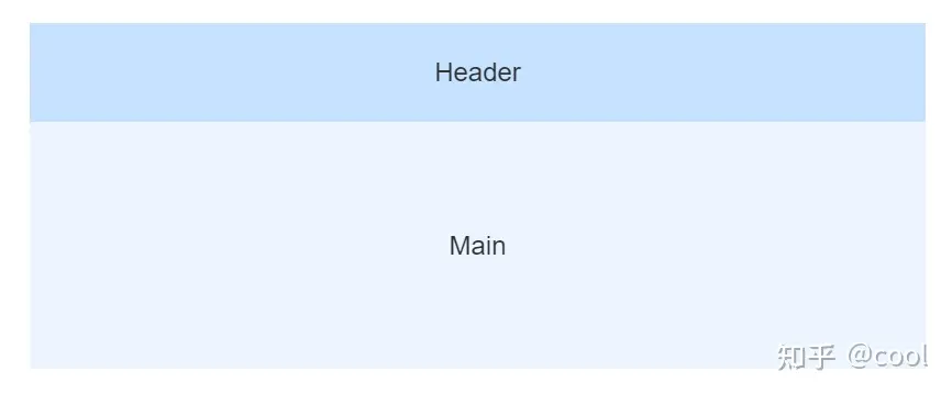
如图所示,这个布局的代码如下:
<template> <div> <el-container> <el-header>Header</el-header> <el-main>Main</el-main> </el-container> </div> </template>
通过这个布局,可以把你所有的样式都放到指定的容器中。
也可以测一测试试:点击element+中的小瓶子
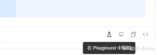
可以打开playground。美中不足的是playground有一些bug,有可能会让你代码在编译中卡住。所以推荐先在自己的本地vscode中完成编译后在放入playground来测试页面效果。
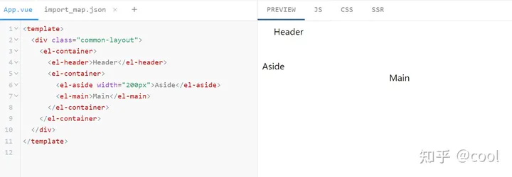
常用的布局推荐:
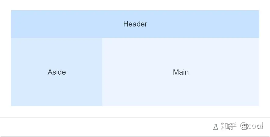
代码如下:
<template> <div> <el-container> <el-aside width="200px">Aside</el-aside> <el-container> <el-header>Header</el-header> <el-main>Main</el-main> </el-container> </el-container> </div> </template>
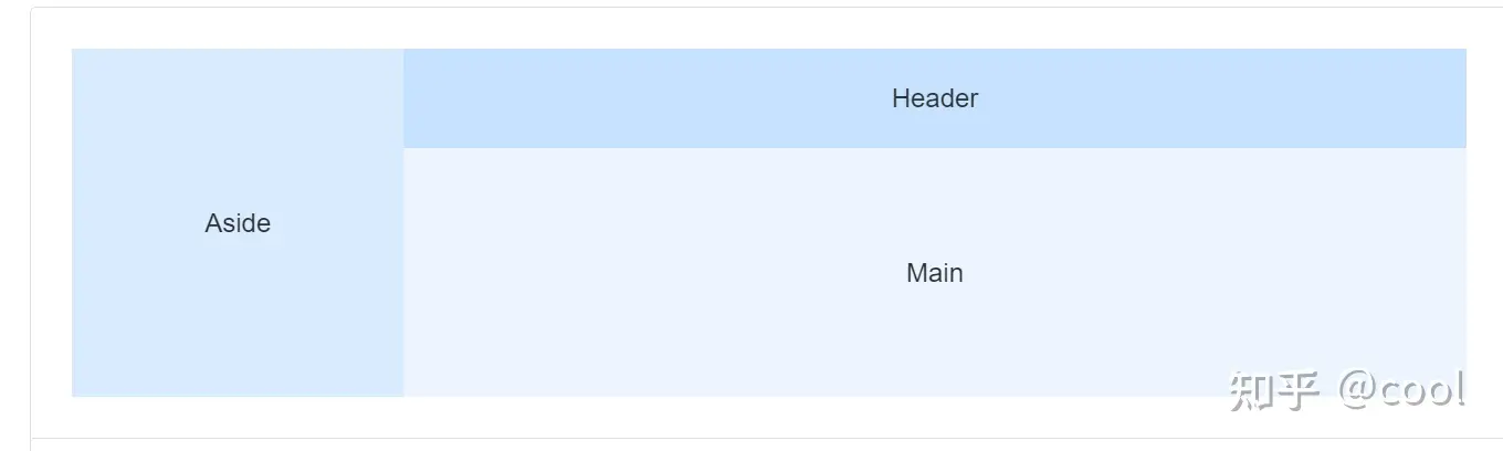
点开playground以后效果如下:
3.3、顶部栏制作
我们先采用上面的这个布局,随后点开菜单这个选项:

找到第一个顶栏的位置,点开源代码:
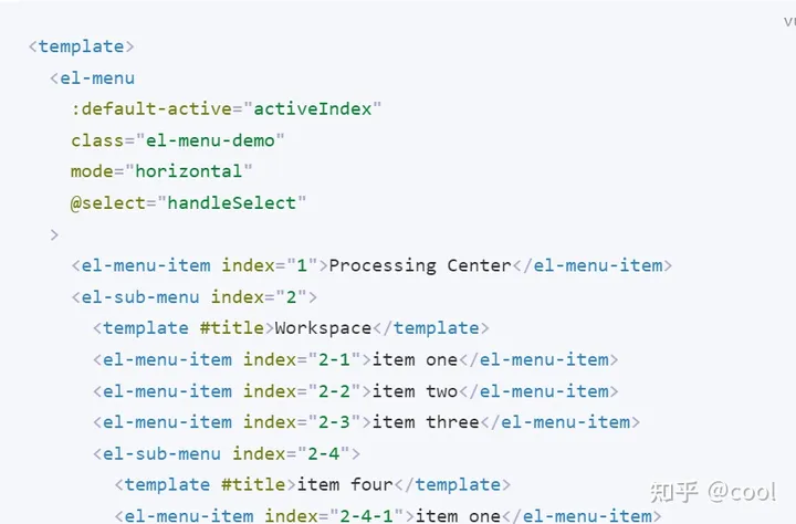
这个源代码很长,我们按照需求截取片段:
<template> <div> <el-container> <el-aside width="200px">Aside</el-aside> <el-container> <el-header> <el-menu :default-active="activeIndex2" mode="horizontal" background-color="#545c64" text-color="#fff" active-text-color="#ffd04b" @select="handleSelect" > <el-menu-item index="1">Processing Center</el-menu-item> <el-sub-menu index="2"> <template #title>Workspace</template> <el-menu-item index="2-1">item one</el-menu-item> <el-menu-item index="2-2">item two</el-menu-item> <el-menu-item index="2-3">item three</el-menu-item> <el-sub-menu index="2-4"> <template #title>item four</template> <el-menu-item index="2-4-1">item one</el-menu-item> <el-menu-item index="2-4-2">item two</el-menu-item> <el-menu-item index="2-4-3">item three</el-menu-item> </el-sub-menu> </el-sub-menu> <el-menu-item index="3" disabled>Info</el-menu-item> <el-menu-item index="4">Orders</el-menu-item> </el-menu> </el-header> <el-main>Main</el-main> </el-container> </el-container> </div> </template> <script setup> import { ref } from 'vue' const activeIndex2 = ref('1') const handleSelect = (key: string, keyPath: string[]) => { console.log(key, keyPath) } </script>
在这个里面通过修改不同参数也可以里面内容的样式。
3.4、侧边栏制作
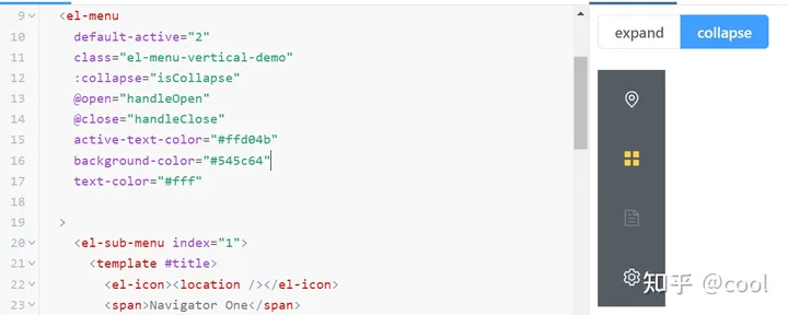
我们先找到侧栏的模板,然后找到刚刚页面布局的Aside部分:
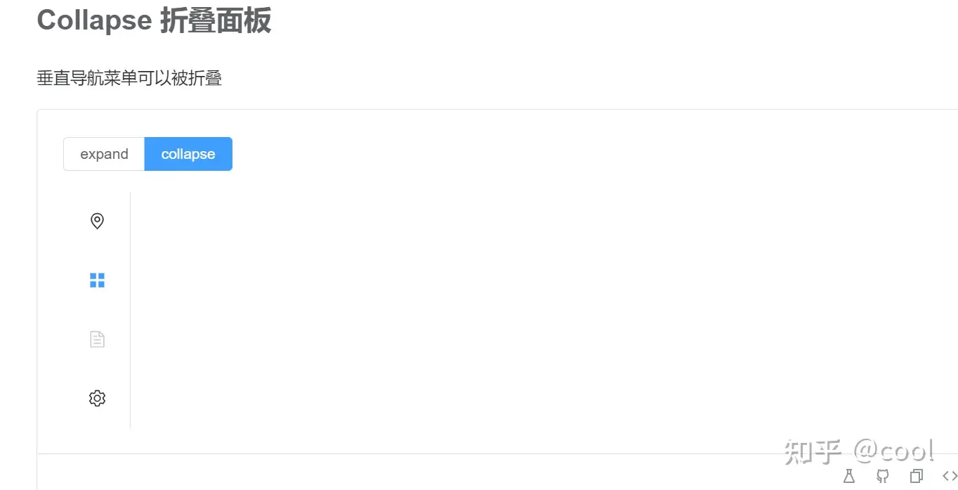
<template> <div> <el-container> <el-aside width="200px"> <el-radio-group v-model="isCollapse" style="margin-bottom: 20px"> <el-radio-button :label="false">expand</el-radio-button> <el-radio-button :label="true">collapse</el-radio-button> </el-radio-group> <el-menu default-active="2" :collapse="isCollapse" @open="handleOpen" @close="handleClose" > <el-sub-menu index="1"> <template #title> <el-icon><location /></el-icon> <span>Navigator One</span> </template> <el-menu-item-group> <template #title><span>Group One</span></template> <el-menu-item index="1-1">item one</el-menu-item> <el-menu-item index="1-2">item two</el-menu-item> </el-menu-item-group> <el-menu-item-group title="Group Two"> <el-menu-item index="1-3">item three</el-menu-item> </el-menu-item-group> <el-sub-menu index="1-4"> <template #title><span>item four</span></template> <el-menu-item index="1-4-1">item one</el-menu-item> </el-sub-menu> </el-sub-menu> <el-menu-item index="2"> <el-icon><icon-menu /></el-icon> <template #title>Navigator Two</template> </el-menu-item> <el-menu-item index="3" disabled> <el-icon><document /></el-icon> <template #title>Navigator Three</template> </el-menu-item> <el-menu-item index="4"> <el-icon><setting /></el-icon> <template #title>Navigator Four</template> </el-menu-item> </el-menu> </el-aside> <el-container> <el-header> <el-menu :default-active="activeIndex2" mode="horizontal" background-color="#545c64" text-color="#fff" active-text-color="#ffd04b" @select="handleSelect" > <el-menu-item index="1">Processing Center</el-menu-item> <el-sub-menu index="2"> <template #title>Workspace</template> <el-menu-item index="2-1">item one</el-menu-item> <el-menu-item index="2-2">item two</el-menu-item> <el-menu-item index="2-3">item three</el-menu-item> <el-sub-menu index="2-4"> <template #title>item four</template> <el-menu-item index="2-4-1">item one</el-menu-item> <el-menu-item index="2-4-2">item two</el-menu-item> <el-menu-item index="2-4-3">item three</el-menu-item> </el-sub-menu> </el-sub-menu> <el-menu-item index="3" disabled>Info</el-menu-item> <el-menu-item index="4">Orders</el-menu-item> </el-menu> </el-header> <el-main>Main</el-main> </el-container> </el-container> </div> </template> <script setup> import { ref } from 'vue' import { Document, Menu as IconMenu, Location, Setting, } from '@element-plus/icons-vue' const isCollapse = ref(true) const handleOpen = (key: string, keyPath: string[]) => { console.log(key, keyPath) } const handleClose = (key: string, keyPath: string[]) => { console.log(key, keyPath) } const activeIndex2 = ref('1') const handleSelect = (key: string, keyPath: string[]) => { console.log(key, keyPath) } </script> <style> .el-menu-vertical-demo:not(.el-menu--collapse) { width: 200px; min-height: 400px; } </style>
觉得这个不好看没关系,后面我们会对这个页面进行一个自主DIY。首先我们先修改如下参数让他们的颜色统一:
active-text-color="#ffd04b" background-color="#545c64" text-color="#fff"
3.4.1、侧边栏优化
有些同学可能觉得这个按键不好看,希望修改一下其中的样式。
这边先展示一些代码,后面在完成vue的学习以后在来让大家完成对这块的改编。(使用v-if来判断目前状态展示按钮)
<el-radio-group v-model="isCollapse" style="margin-bottom: 20px"> <el-radio-button :label="false" v-if="isCollapse" ><el-icon><fold /></el-icon> </el-radio-button> <el-radio-button :label="true" v-if="!isCollapse" ><el-icon><expand /></el-icon ></el-radio-button> </el-radio-group>
上面代码需要在底下script中引入如下内容:
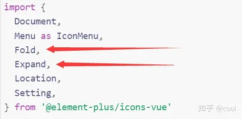
Fold, Expand,
3.5、主体内容增加:
Element+有两种模式,一种是你去做一个只有顶部导航栏和侧面导航栏的框体,其他内容通过vue直接渲染到主体。另一种是直接自己在主体中编写内容。
由于我们现在没接触过vue,所以我们先来尝试一下使用原生的代码实现一个主体页面编写。
我们先找到按钮这个位置:
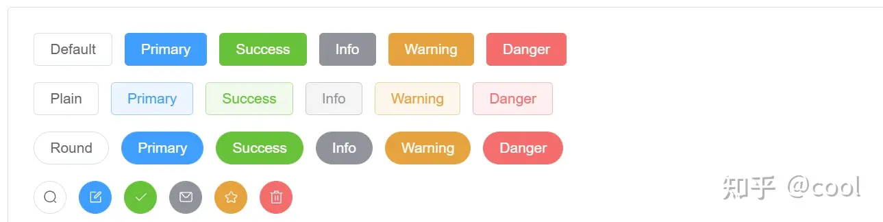
找到我们喜欢的样式
注:下面那种带图标的按钮可能需要引入额外的Element-icon
我们先试试如下按钮:
<el-button type="warning">Warning</el-button>
把他放入我们的主体,也就是main里面:
<el-main> <el-button type="warning" >Warning</el-button> </el-main>
那么这个时候呢,有些同学可能想问,如果我不想要这个样式怎么办呢?
让我们来试一个东西:
<el-main> <el-button type="warning" style="width:300px">Warning</el-button> </el-main>
好!神奇的事情发生了,我们惊奇的发现按钮的样式发生了改变。也就是说这个框架是支持我们之前使用过的css引入模式的。
注:虽然可以使用css样式,但是禁止使用js的函数,功能。由于新版Element+集成的是TypeScript,所以使用JS会爆发冲突。后续注册事件可以使用vue方法来实现。
3.6、Element+总结
除了完成课堂案例以外,我给大家在布置一个额外的作业。
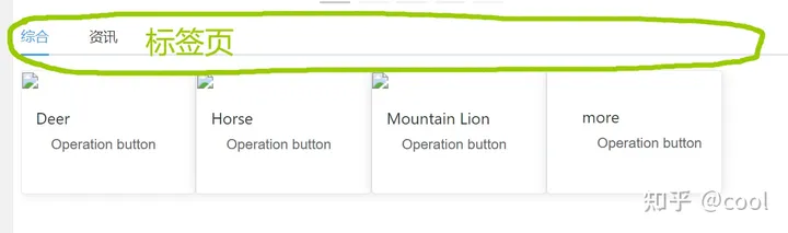
4、作业:
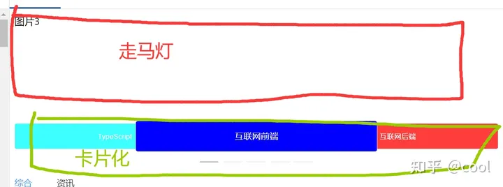
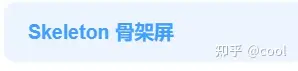
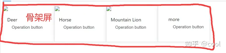
使用Element+的骨架,幻灯片,走马灯功能实现如下页面布局:
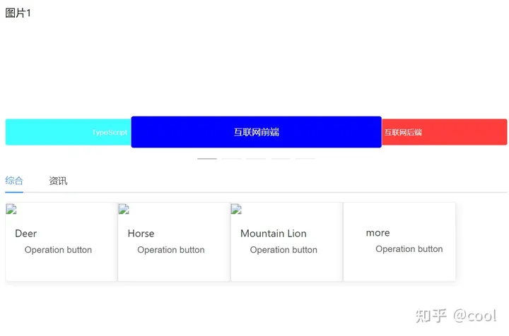
详细布局模板如下:


作业答案在课件中有。
注:
如果出现如下报错:
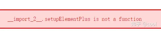
直接把这条剪切掉:
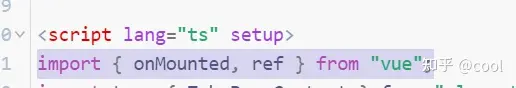
重新粘贴回去,即显示正常。
该文章在 2024/4/3 12:15:54 编辑过


 400 186 1886


